Bite Essence
An artisanal dessert brand with a tagline worth designing around: “Desserts that love you back.” The exploration delivered four complete brand routes — each a full system of logotype, monogram, palette, pattern and box — so the client could choose a personality, not just a logo.
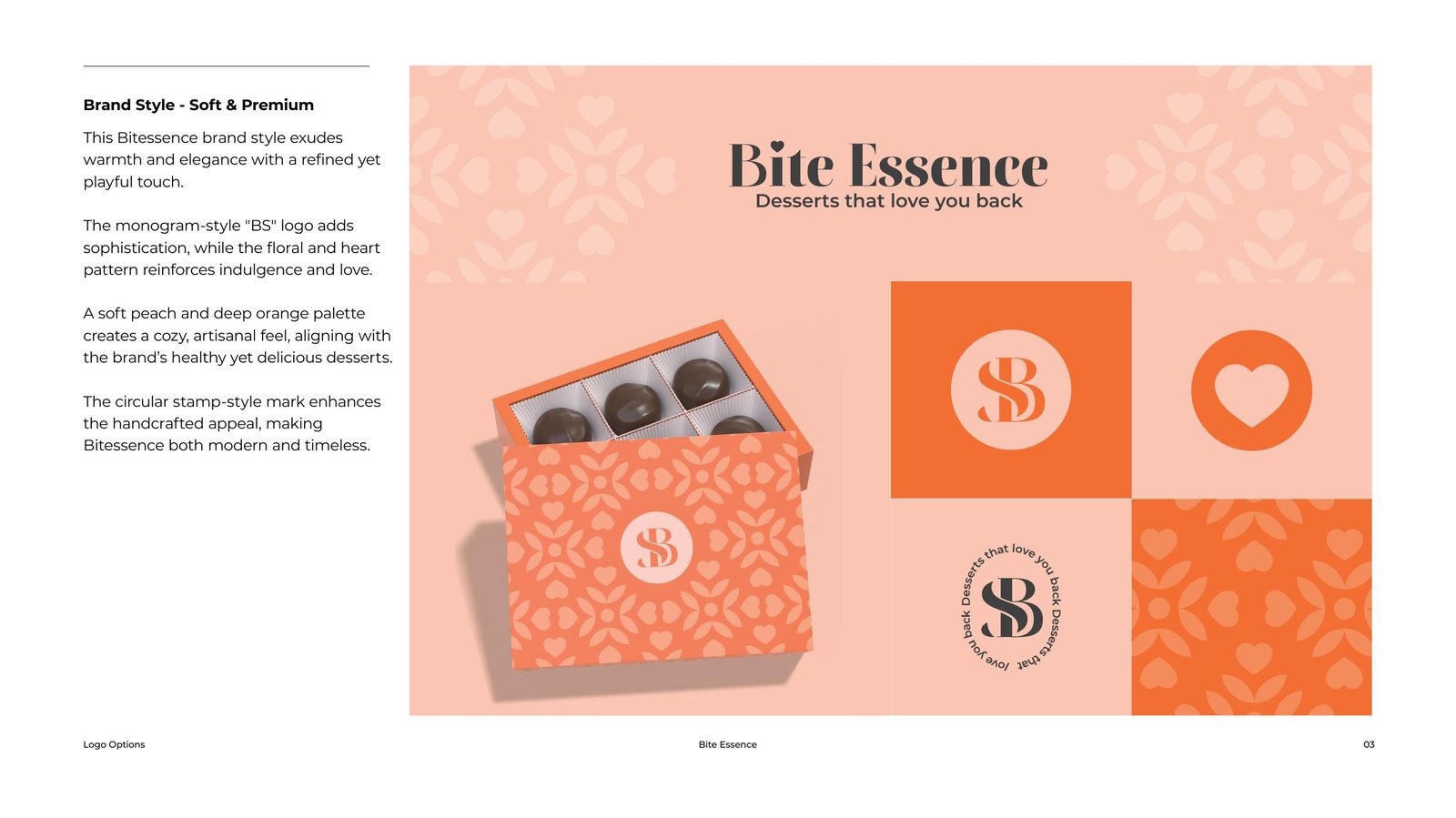
Route 01 — Soft & Premium
Warmth with a refined, playful touch. A monogram-style “BS” stamp adds a handcrafted, circular seal; floral and heart patterns carry the indulgence; and a soft peach and deep orange palette keeps the brand cosy and artisanal — healthy and delicious.
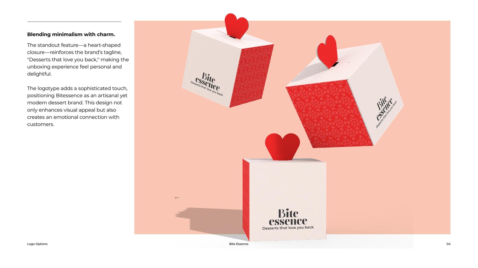
The structural idea that makes this route memorable: a heart-shaped closure on the box itself, so the tagline is physically built into the unboxing.
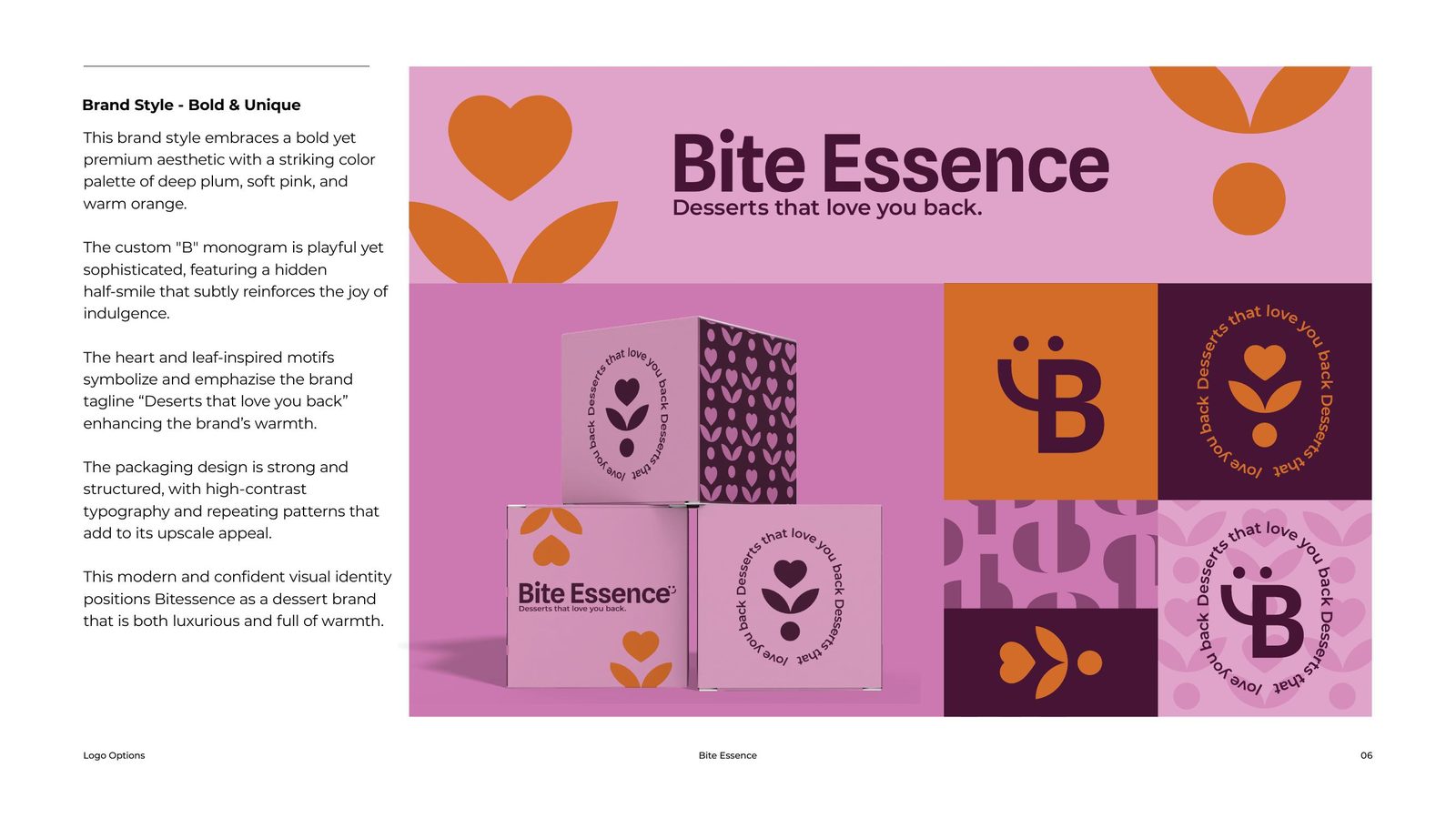
Route 02 — Bold & Unique
Deep plum, soft pink and warm orange make a confident, contemporary palette. The custom “B” monogram hides a half-smile in its counter — a quiet joke about the joy of indulgence — while heart-and-leaf motifs and structured repeating patterns push the system upscale.
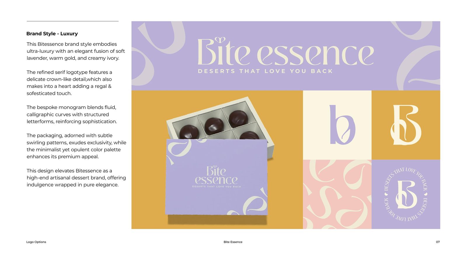
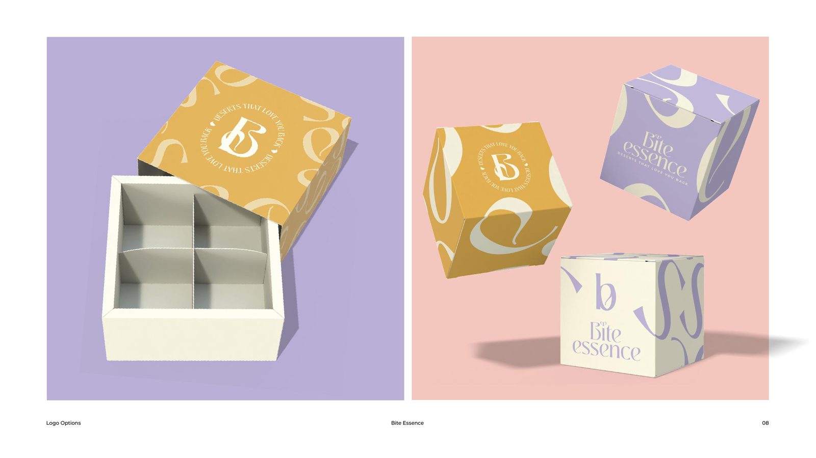
Route 03 — Luxury
Ultra-premium territory: soft lavender, warm gold and creamy ivory. The serif logotype carries a delicate crown detail that doubles as a heart; the calligraphic monogram blends fluid curves with structured letterforms. Swirling patterns on the packaging keep the exclusivity tactile rather than cold.
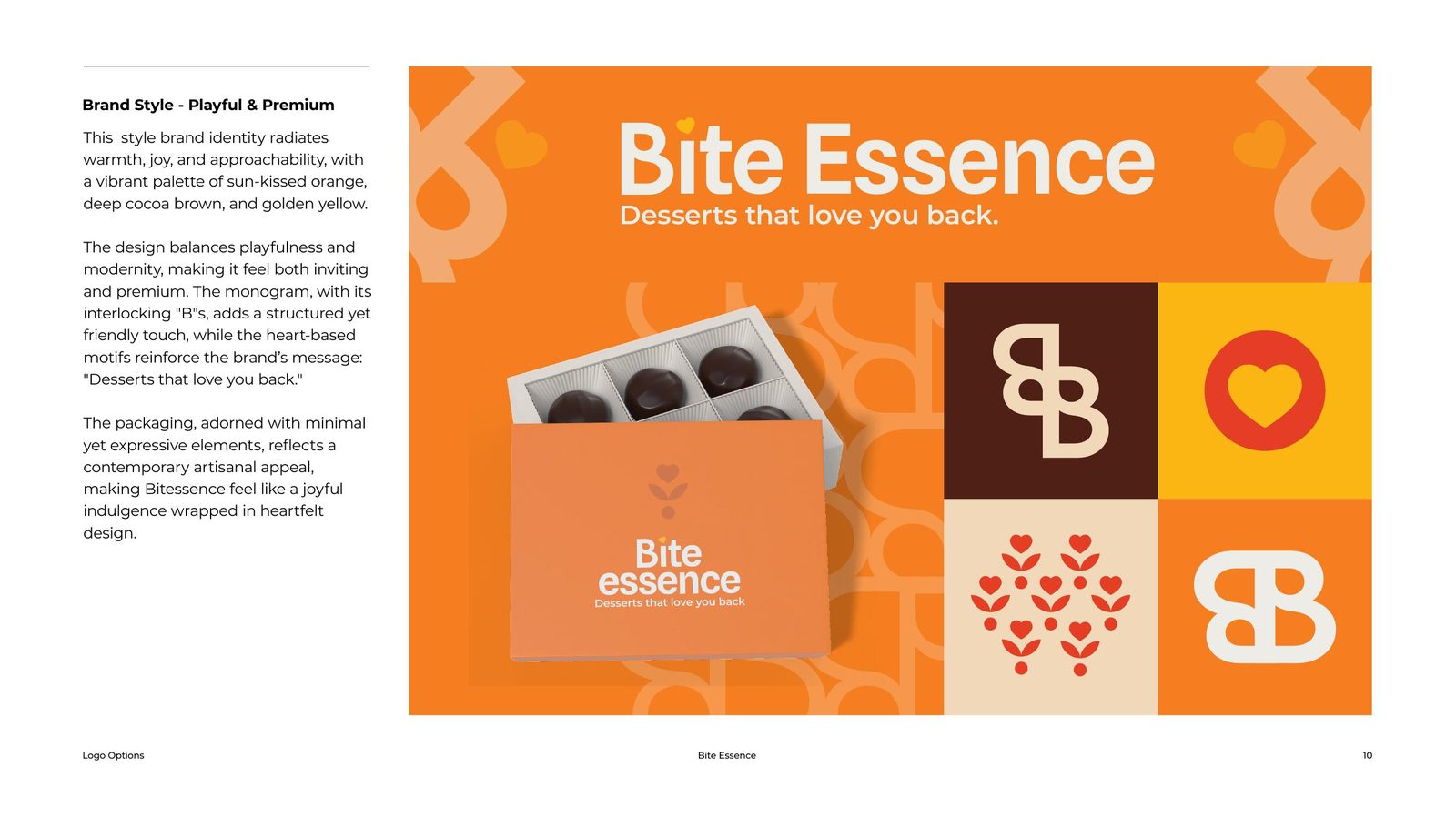
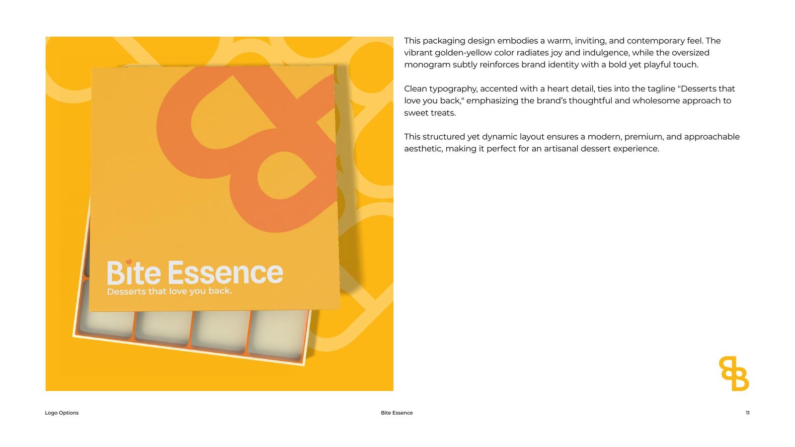
Route 04 — Playful & Premium
The most extroverted route: sun-kissed orange, cocoa brown and golden yellow, a clean white logotype, and interlocking “B” monograms that tile into pattern. Heart-shaped motifs keep the brand message present while the system stays fast, friendly and modern.
Why Four Routes?
A dessert brand competes on feeling. Showing one direction invites feedback on details; showing four genuinely different personalities — each finished to packaging level — forces the more useful conversation: who is this brand? Every route here is buildable as delivered, down to the box structures.
Choosing your brand’s personality?
We design complete, production-ready brand routes — not mood boards — so you decide against real packaging. Tell us about your product and we'll map the territory.