The Gifter’s Hub
A packaging series for handicraft photo frames built on a simple production truth: one structural keyline, three art directions. The shelf gets variety; the press gets efficiency; the brand stays unmistakably itself across every SKU.
Series Logic
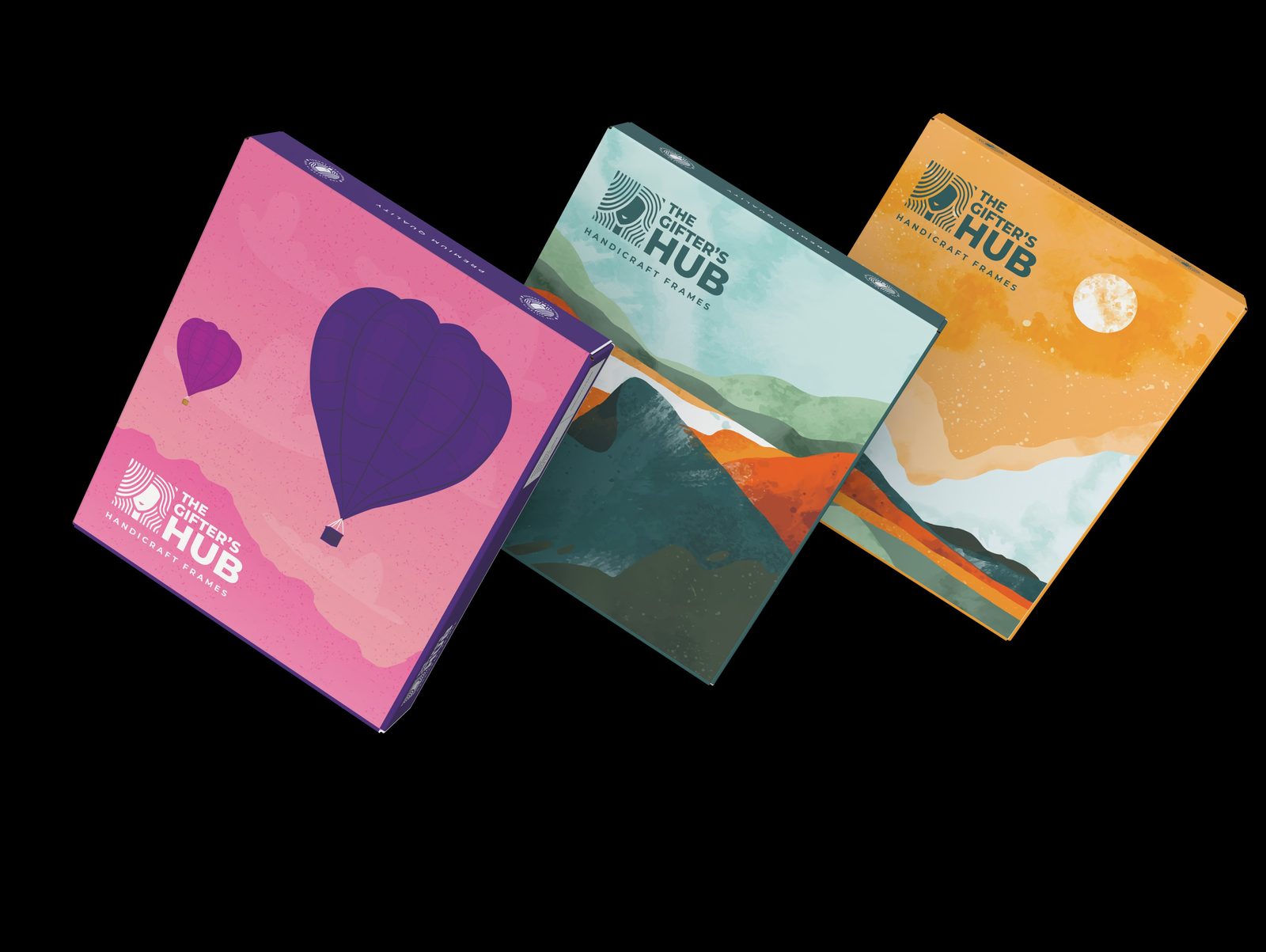
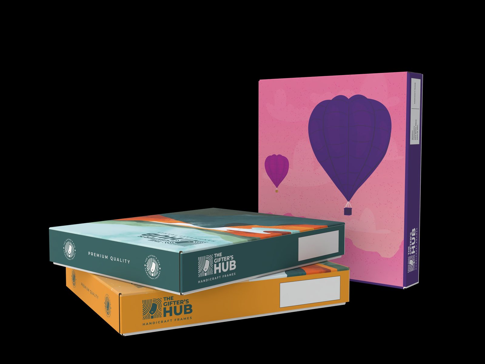
Each SKU carries its own scenic world — hot-air balloons over pink skies, layered mountains, a moonlit valley — painted in a shared illustration style and anchored by the same logo lockup. Buyers see a collection worth completing; the printer sees one keyline with swapped art.
The side panels do quiet, practical work: a “Premium Quality” strip, repeated brand seals, and a clear white declaration window for SKU, quantity and MRP labelling — so retail compliance never has to be stickered over the artwork.
Built for Real Shelves
Frame boxes live flat in storage and upright on display. The artwork is composed so the lockup and series identity read in both orientations, and the palette holds its contrast under ordinary shop lighting on coated corrugated stock. Pretty is easy; pretty that survives retail is the job.
A product family that needs shelf presence?
Series packaging is a system problem before it's an art problem. We design SKU families that scale without multiplying your print costs.