Brume — Luxury in Every Drop
Brume — French for mist — needed a wordmark as weightless as its name. The brief asked for a purely typographic logo: no symbols, no ornament, just letterforms refined until they carried the softness, elegance and quiet of mist on their own.
The Brief
The client wanted a wordmark that felt modern and timeless at once — clean lines, a refined editorial character, and nothing decorative competing with the product itself. The direction board pointed to soft neutrals, elegant typefaces and airy compositions: the calm, ethereal quality of mist, translated into type.
Rather than presenting one safe answer, the studio developed three complete logo directions, each with its own monogram and application mockups, so the decision could be made against real packaging — not against a blank page.
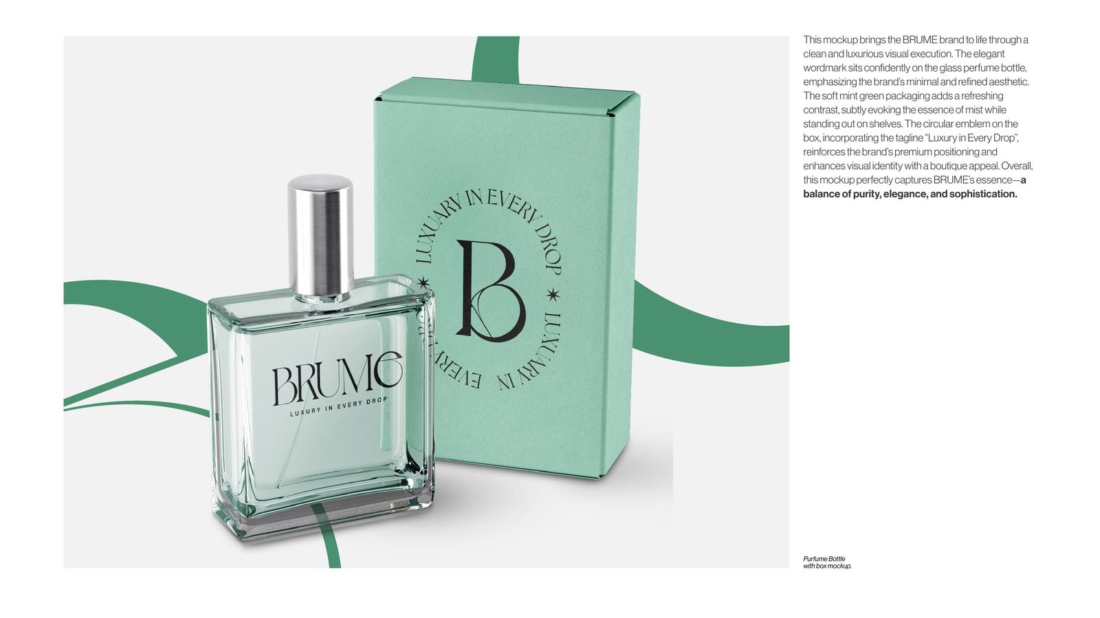
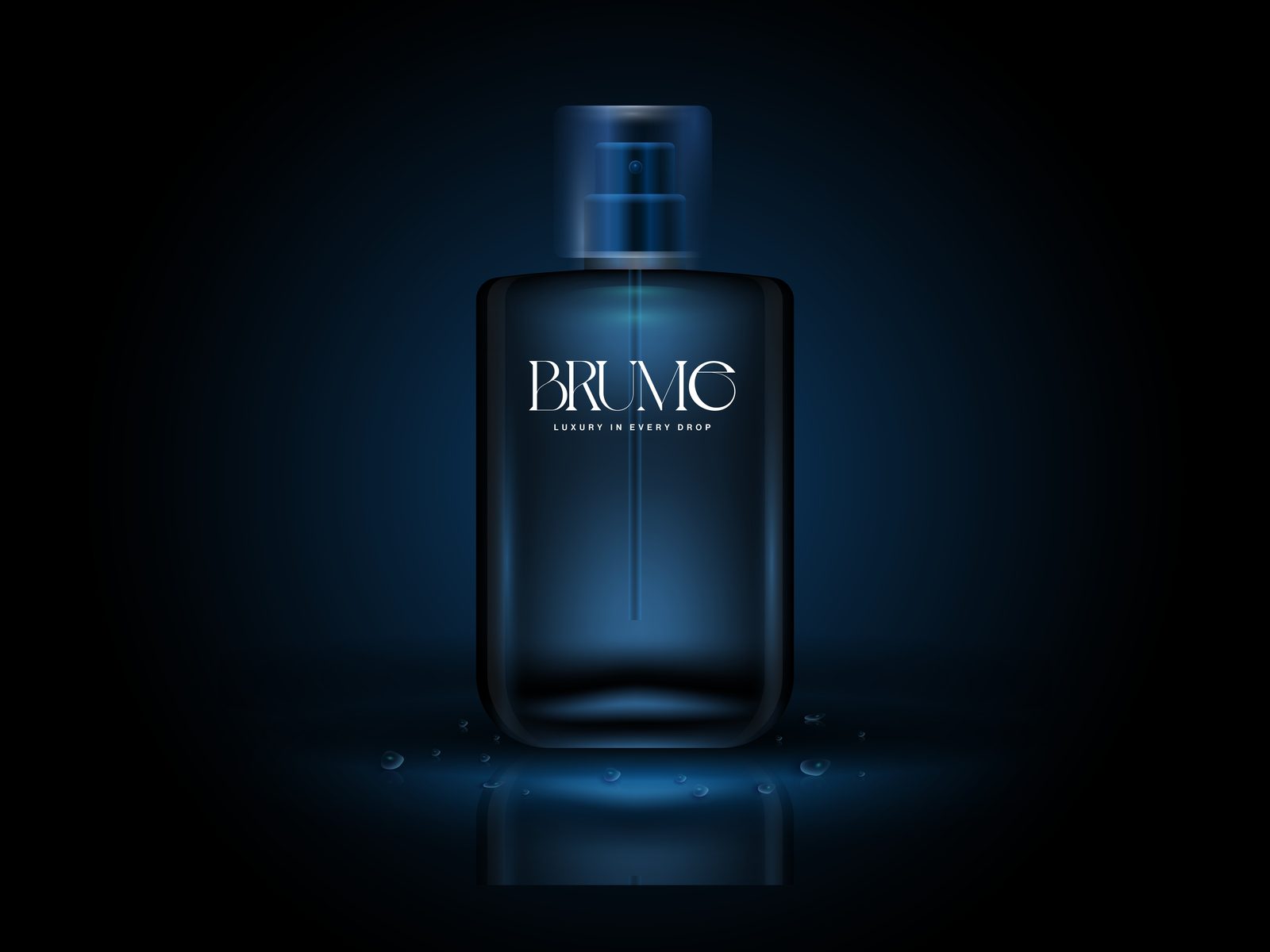
Direction 01 — High-Contrast Serif
The first route leans into sophistication: a high-contrast serif with graceful curves and sharp terminals. Extended letterforms and a custom treatment of the “e” create the soft, flowing movement of mist — light, airy, fluid — anchored by the tagline “Luxury in Every Drop”.
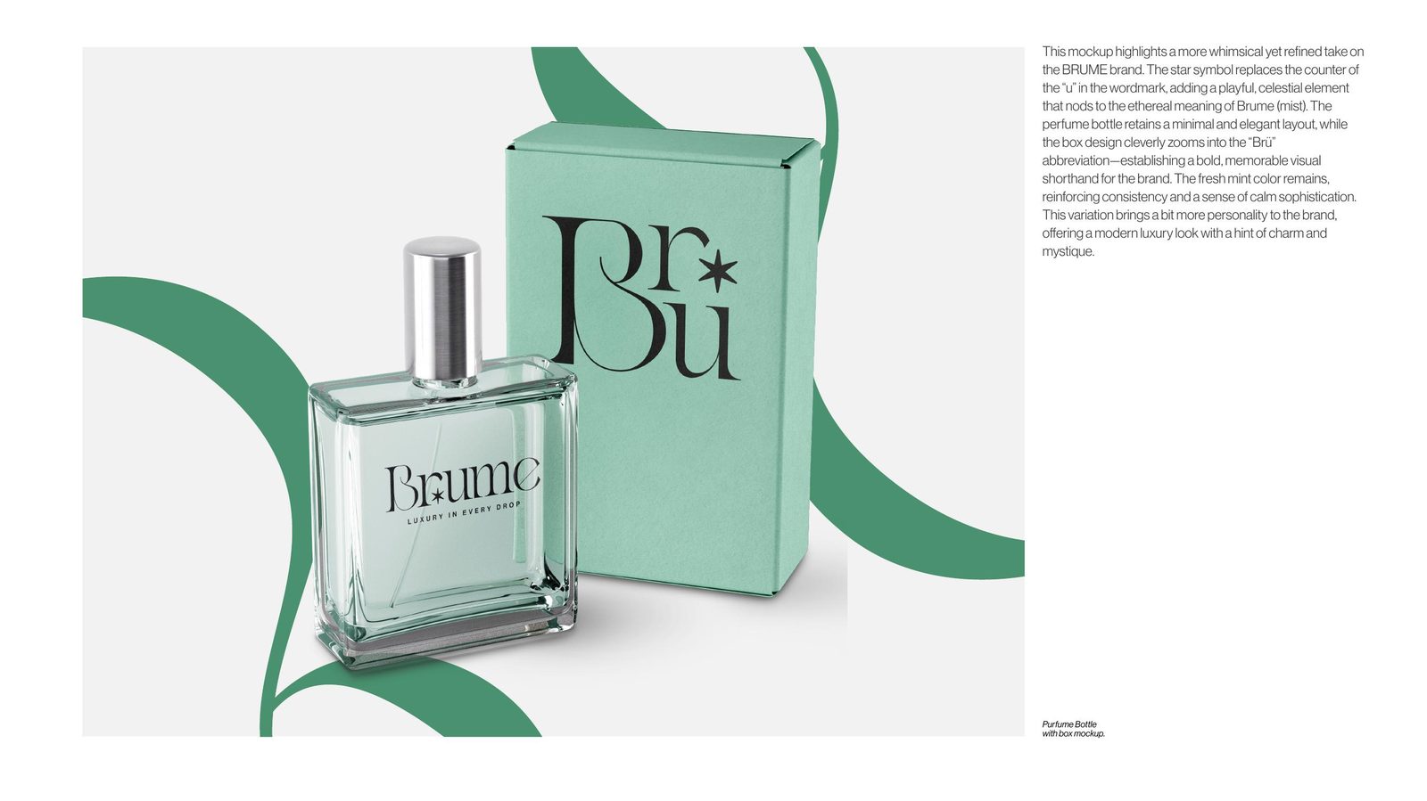
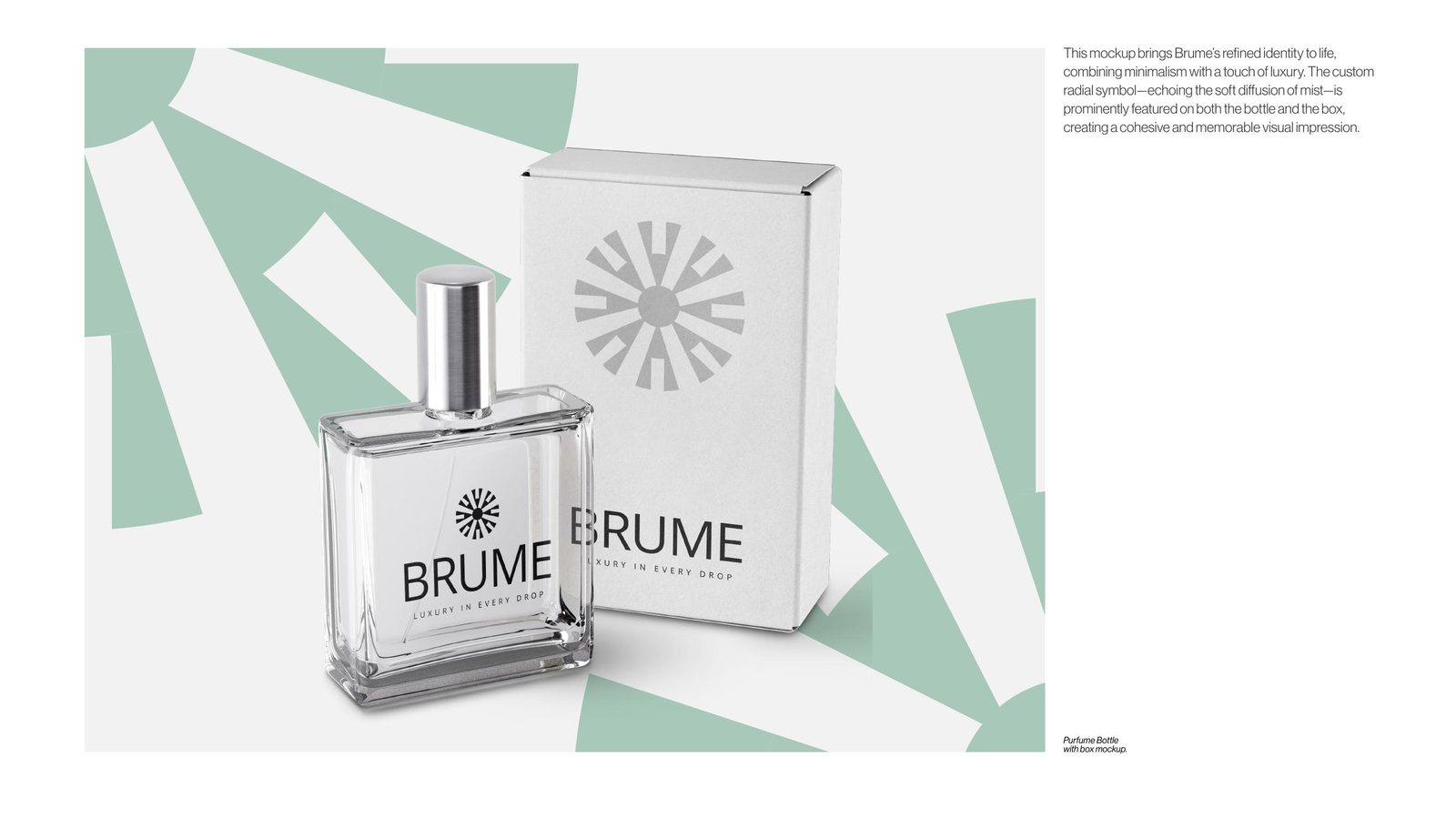
Directions 02 & 03 — Testing the Edges
Direction 02 keeps the serif elegance but introduces a star in place of the “U” — a more whimsical, radiant take on the same tagline. Direction 03 strips everything back to a clean geometric logotype with a starburst emblem, testing how far the brand could move toward minimalism before losing its softness.
Presenting the edges of the territory is deliberate: it lets a client choose with confidence, knowing what the alternatives actually look like in production.
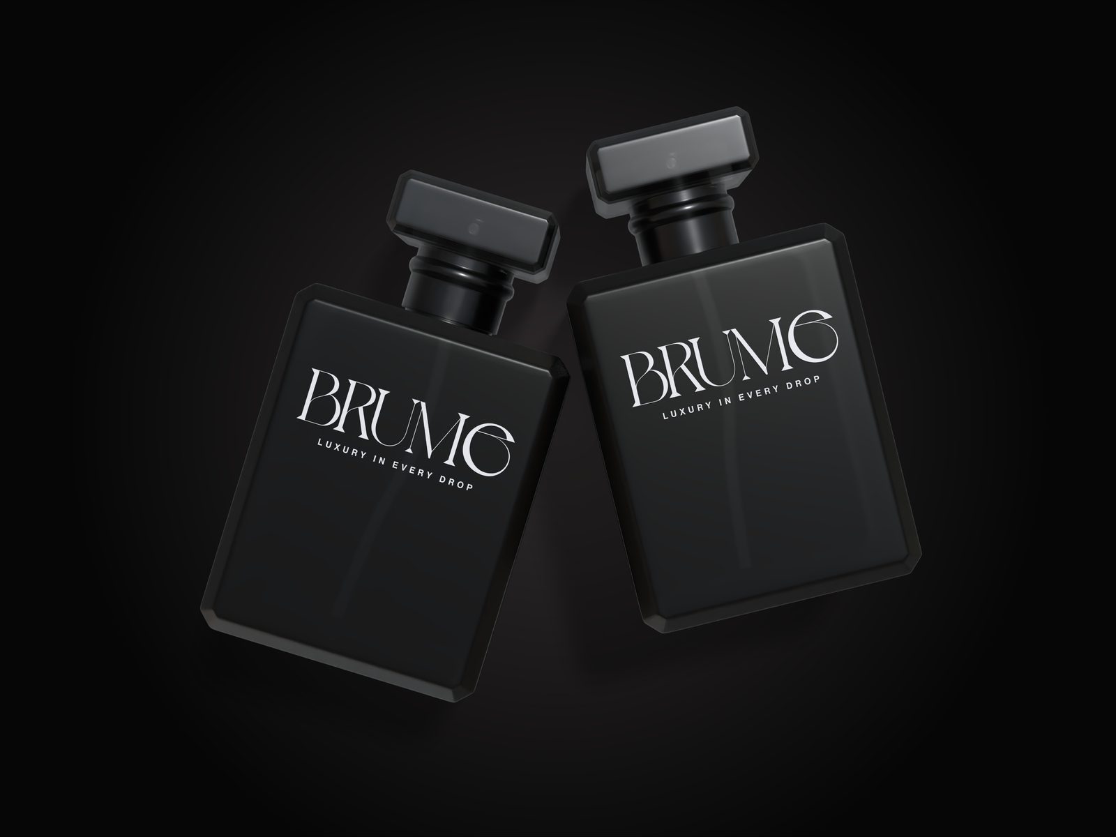
The Selected Identity
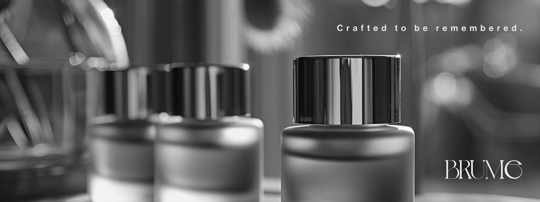
Direction 01 was selected and refined into the final suite: the full wordmark, standalone B and e monograms for caps and secondary touchpoints, and a circular label/sticker system that carries the tagline around the mark — built for foiling, embossing and small-format printing.
The black-and-white system is intentional. A fragrance brand lives across many bottle colours and finishes; an identity this restrained stays in command on every one of them.
Building a premium brand?
If your product deserves an identity engineered with this level of care — from the first sketch to print-ready vectors — tell us about it. We respond within one business day.