Tyohar in Metro
A festive gifting brand built on one promise — “Where Tradition Meets Celebration”. The packaging had to feel like the festivals it carries: dense, joyful, unmistakably Indian — while staying disciplined enough to print cleanly on corrugated board and survive courier handling.
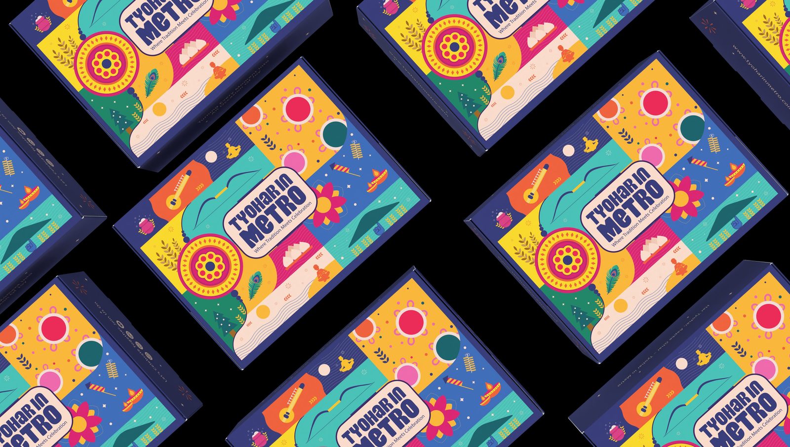
A Modular Festival Grid
Instead of one hero illustration, the surface is built as a modular tile grid of festival motifs — rakhi, diya, sitar, mithai, fireworks, kites and rangoli forms — each sitting in its own colour field. The grid lets the same artwork system scale across box sizes and future SKUs without redrawing: tiles rearrange, the brand stays whole.
A deep navy base holds the riot of colour together and gives the logo badge a calm landing zone at the centre of the lid.
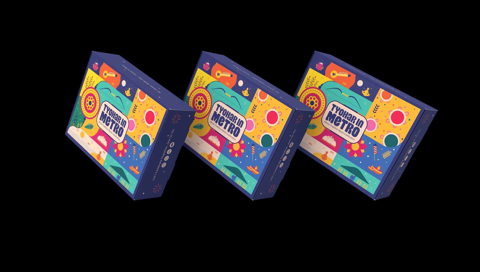
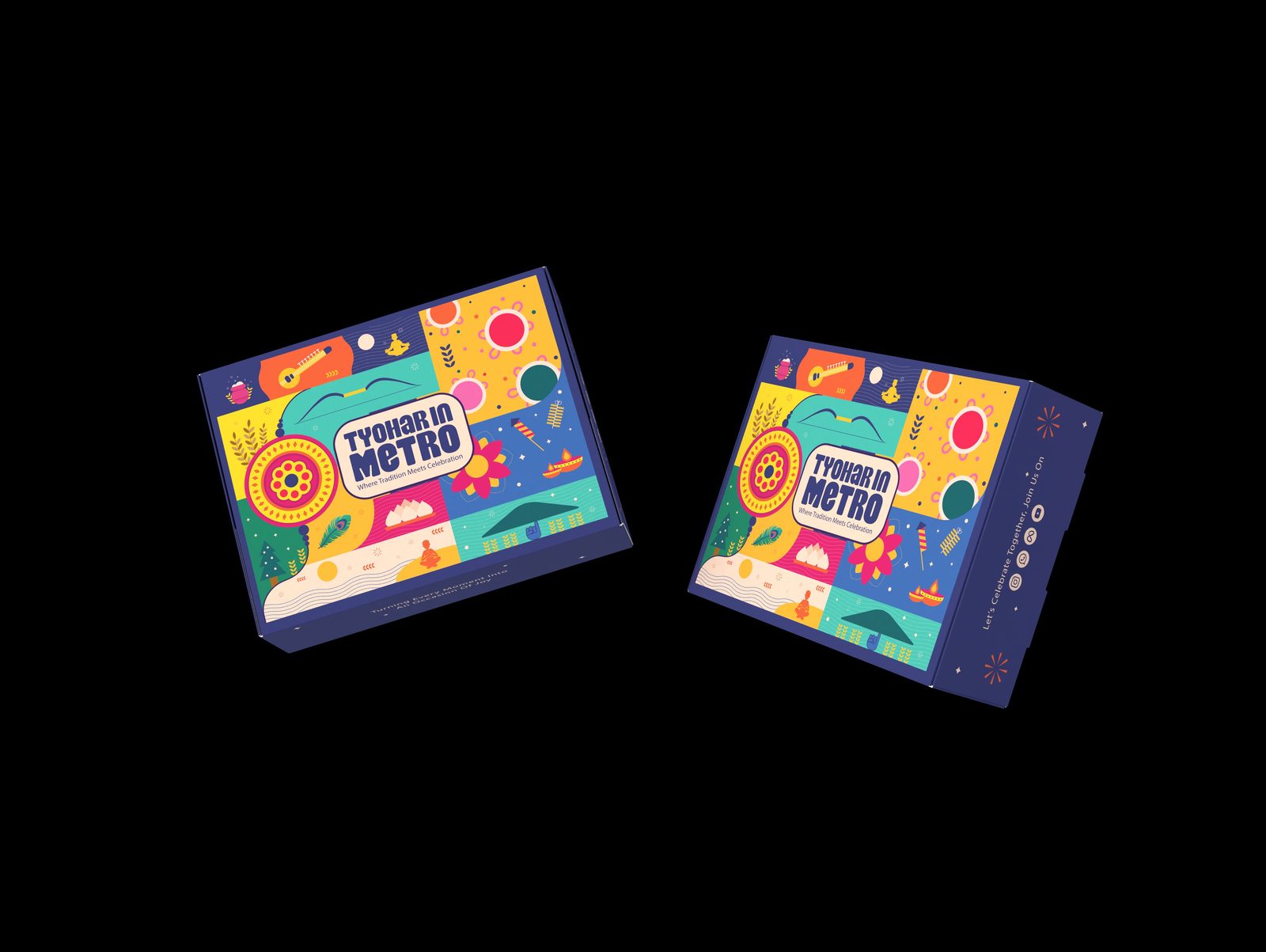
Engineered for the Box, Not the Screen
Artwork was composed directly on the dieline, so motifs land where panels fold: the pattern wraps over edges without beheading an illustration, and the side panels carry their own messaging — “Let’s Celebrate Together, Join Us On” with social icons — turning every stacked box into a small piece of media.
This is where a factory-floor background pays off. High-coverage process printing on corrugated board punishes careless art; alignment, bleed and ink coverage were planned for the press, not patched after it.
Launching a gifting range?
Festive packaging has hard deadlines and harder print runs. We design artwork that lands on the dieline correctly the first time — and looks like a celebration on the shelf.