Goatline — Wear the Challenge
Two engagements for a fitness apparel brand. First: their existing ram logo existed only as a low-resolution raster — unprintable at scale. It was rebuilt from geometry up into a balanced, print-ready mark. Second: an original series of compression t-shirt graphics to put that attitude on fabric.
Part 01 — Rebuilding the Ram
The original mark was a raster image: fine on a phone screen, useless on a screen-printing frame. The ram was reconstructed using geometric circle construction — every horn curve and facet snapped to a precise proportional system — producing two clean fill variations with the symmetry and consistency the original only implied.
Typography on the Golden Ratio
Wordmark options were tested against the mark, with the hierarchy between GOATLINE and WEAR THE CHALLENGE set on a 1.618 type scale — the golden ratio — for a lockup that feels balanced before you can say why. A five-point star was added above the ram with “20 25” flanking the head, giving the brand a varsity-grade crest without cliché.
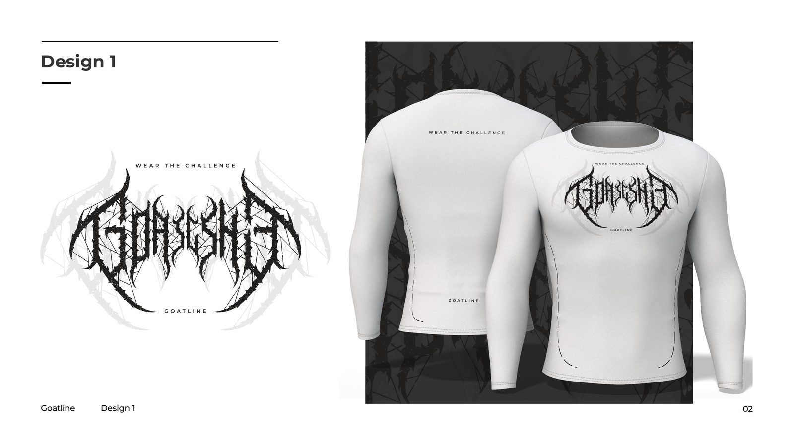
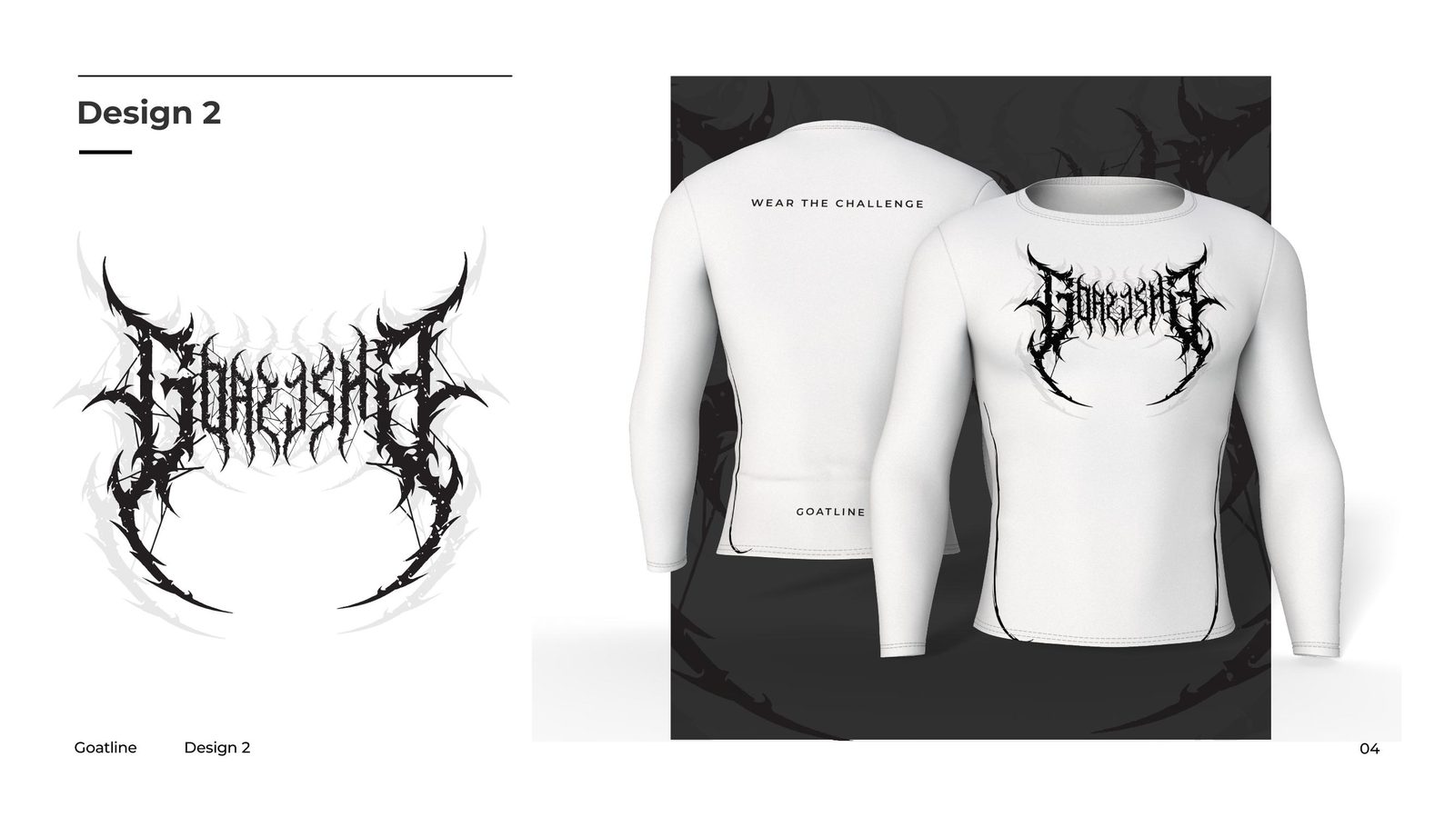
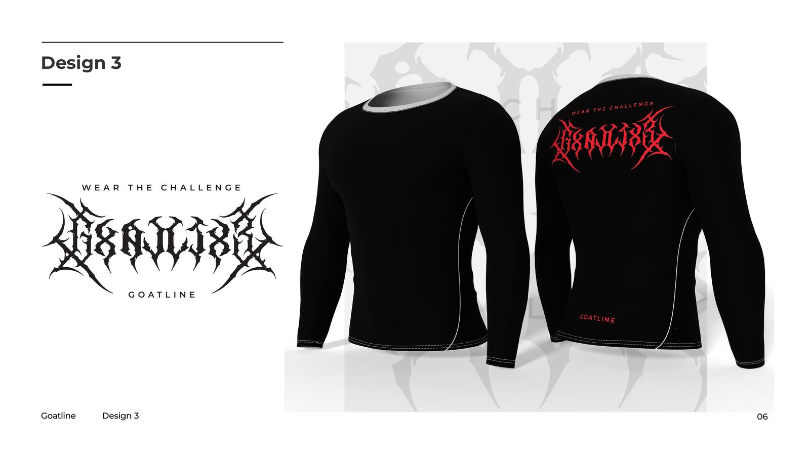
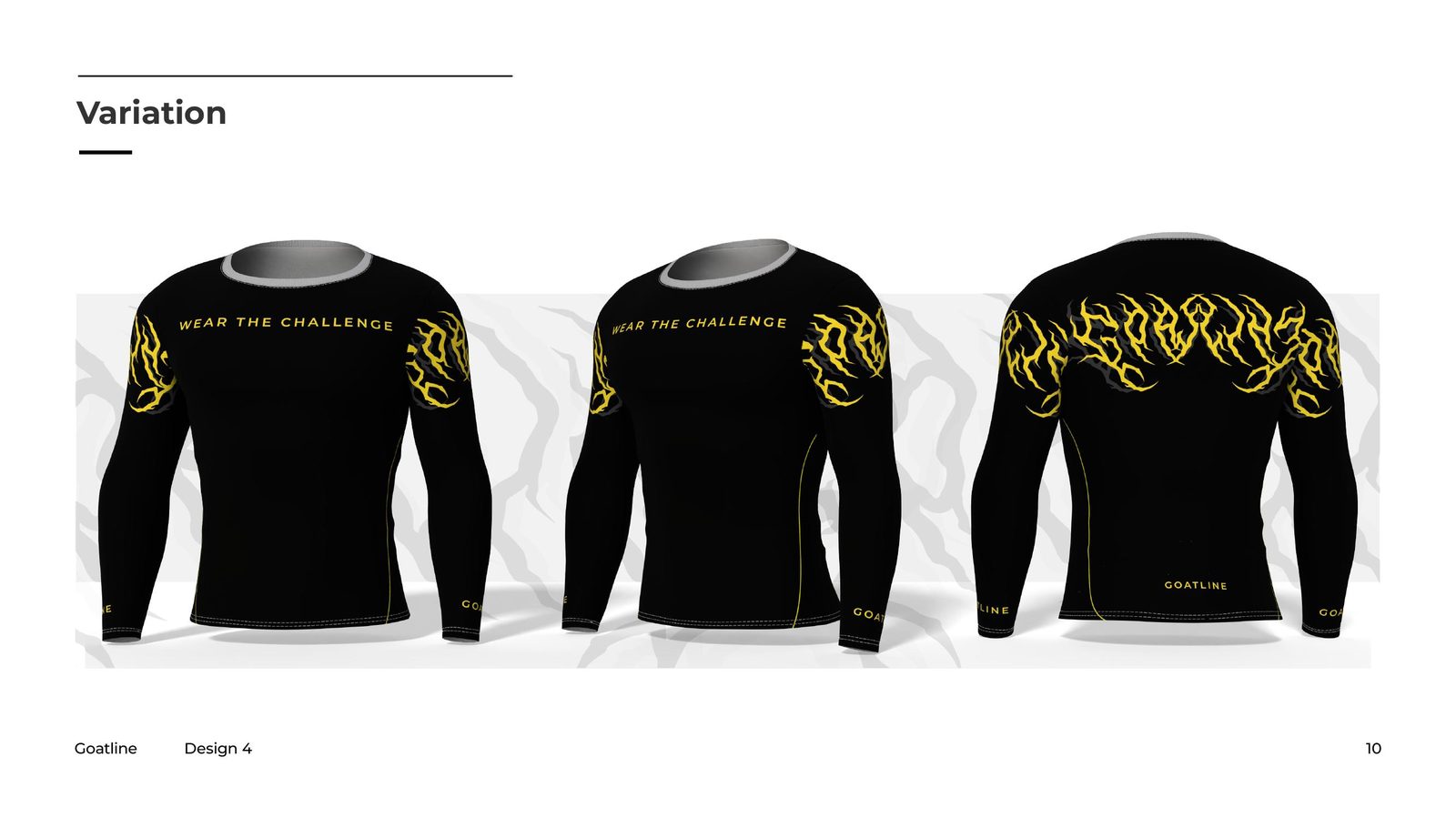
Part 02 — The Compression Tee Series
With the identity stabilised, the brand wanted apparel graphics with teeth: an original series of four deathmetal-inspired logotype designs, each hand-drawn around the Goatline name and produced with placement variations on white, black and grey compression shirts — chest hits, full-front prints and back-panel layouts.
Why This Case Matters
Most studios would have traced the old logo and moved on. Rebuilding it geometrically means every future application — embroidery, screen print, signage, this very t-shirt series — starts from a mark that cannot fall apart. That is what “print-ready” actually means.
A logo that won’t print right?
If your mark falls apart on fabric, signage or cartons, it isn't finished. We rebuild logos into mathematically clean vectors — and design what goes on them next.